Wednesday, April 27, 2016

First major piece, ready for paint...

Our set for "Atomic" consists of two major playing areas, the bar area, and the ROOM.  The ROOM is a fairly generic, 1930's era room with the ceiling defined by the floating beams and dish lights.

The ROOM serves as locations for almost the whole show and varies as a college classroom, a lab, Leo and Trude's home, and some location for a wedding/funeral.  So, it has to be a bit timeless and really speak to the era and not a specific place. Separating the ROOM from the band is the wall with 2 big windows and a door.

Last weekend, Kate, Melanie and I got the framing for the wall figured out and built.  When finished, it is over 9 feet tall and about 15 feet long...a BIG wall on a small stage.    This wall free-stands in the middle of the stage with no platforms or theater walls to brace it to.  AND it has an operable door, so it mustn't wobble or shake when the door is opened and closed.

I began with a full-height 2x8 at each end with a 12" full-height return, turning upstage toward the band.  Then off of the return, a 3-foot high wing wall to help act as a band muffle, which also gives us a bit if a diagonal brace support when it is screwed to the floor.

Across the head, we tied it together with a 12' long by 5-1/2" high luan covered "flat" which provides a continuous support.  A 3' high x 8' long luan "flat" is under the windows with another narrow "flat" between the windows.


At the end of the windows is a 3rd 2x8 that goes from the floor to the underside of the head flat at the top.  This gives me a 2x8 vertical on each side of the door frame.  I made two triangular kicker braces to anchor between the windows and between the window and door frames.  These tied to the floor should brace the wall unit in the middle, allowing it to free-stand.

The two wing walls are capped with a 1x4 sill, then a continuous chair rail runs under the caps, under the window sills.  6" ogee base finishes off the carpentry.


Colors

So, in the 1930's and 40's, popular tastes rebelled from the tradition of dark stained and varnished woodwork in buildings.  This dark woodwork was associated with heavy, old-fashioned Victorian styles.  In old buildings, most of this varnish had aged over the years so that it was so deep red/brown that it appeared black and very heavy.  People began painting over this old woodwork. Often the trim was painted white and the walls a color.  The effect of this treatment was that the rooms lightened up immensely and became brighter and more pleasant.


 For our paint scheme in the ROOM, I am keeping with this concept.  The ceiling beams, baseboard, chair rail, and window and door frames are all painted creamy white.  It was not uncommon for the door leafs to remain dark, stained and varnished wood.  Ours will remain that way.

The color pallet in the 1940's shifted away from busy wall paper patterns in the 20's and 30's, a carry-over from Victorian.  The colors were bright and saturated...baby blue, ochre yellow, burnt red, and the quintessential lime green.  Almost everyone of my generation when to school in or had a grandparent with rooms painted this lime green color.  It was the HOT color during WWII.  So... I HAVE to use that as our wall color.  It just so perfectly typifies 1940.
Last week, Sharon put a fresh coat of white on the windows and door frames. Last night, Kate and Melanie put a first coat on the trim.  Tomorrow, I'll have Sharon paint the green.

Then this weekend, we can knock it down into components that can be transported and we will begin the bar...a very different aesthetic.

R

Saturday, April 23, 2016

It's been a big few weeks!

It has been a busy and BIG last couple of months.

In March, we had "American Idiot" onstage at New Line Theatre which ran to sold out houses for EVERY SINGLE PERFORMANCE!!!!

The reviews were wonderful and the show really rocked...literally!

I provided scenic design and fabrication for the show.


Following that, we ran "Hedwig and the Angry Inch" at Stray Dog Theatre.  For this production too, the houses were packed. Michael Baird turned in a stellar performance as Hedwig and Justin Been extracted something really special from this show.

For this show as well, I did scenic design and fabrication, including 10 fake speakers...looked like a Grateful Dead concert!

Again, the reviews and audience reactions were amazing!


Last weekend, while we struck Hedwig, we had "Disney's The Little Mermaid" onstage at Whitfield School.  I designed the set and lighting and Gary painted the whole thing.  It really dazzled...


In addition, on March 21, I attended the St. Louis Theater Circle Awards with Kathleen, Melanie Kozak, and Kate Wilkerson.   I had 3 nominations in the Outstanding Scenic Design for a Musical category; "The Mystery of Edwin Drood" and "Dogfight" at Stray Dog Theatre and "Heathers" at New Line Theatre.  While I didn't win any of them, it got a chuckle out of the audience when they got to my category.

On the amateur side,  last fall Kathleen directed a production of "The Elephant Man" at Looking Glass Playhouse.  It was nominated for NINE AFL Theater Mask Awards, including myself for Best Lighting of a Play, Melanie for Best Supporting Actress, Kathleen for Best Director, and the Best Drama award.  We managed to take home 3 awards that night,  Mitch Ellis-Yapp for Best Actor, Cathy Symonds for Best Costumes, and the Best Drama.  It was a GREAT night!


Thursday night, Kathleen, Melanie, Kate and I attended the St. Louis Post Dispatch GO Magazine List Awards party at the Missouri History Museum.

I was chosen by the readers as the Best St. Louis Scenic Designer.  I have never won a popularity contest before, so there's a first for everything.

Hey, at least it was a free party, with drinks and snacks. :)


So, now on to what's next.

In February, I was hired at Thomas Jefferson School as a fill-in replacement for the arts teacher who taught scenic design and theater tech. This position also has the responsibility for overseeing the design, fabrication and installation of the set as well as the lighting for the spring eighth grade play.  This year's show is "Agatha Christie's And Then There Were None"... where have I done that before???  So, we have a set designed and are in the process of fabricating it.  This happens mostly in class time and during the school day with the kids, so while it is yet something else on my plate, it doesn't necessarily cut into my other professional theater work. TJS's show loads into the gym on Friday, May 13 and is on stage Thursday, May 26 and Friday May 27 at 2PM.  Then we strike that show and put everything away following the final performance.

In the mean time...  we are in fabrication in the shop for "Atomic", the third show of the season at New Line Theatre.  It loads into the theater on Saturday, May 14...yes the day after the show at TJS.  Fortunately, we have a good jump on fabrication, so it shouldn't be TOO big of a scramble to finish things in time for a trailer or two to make their way toe the Marcelle that Saturday by 10AM.

For "Atomic" I am also doing the lighting, so as soon as we get the show loaded in, I have to get my head into lighting.  We hang and focus on Saturday May 21 with cue-to-cue the following Saturday, May 28...again, yes, the day after we strike "And Then There Were None" at TJS.

"Atomic is on stage from June 2 - June 25. On Sunday, June 26, we strike the show. At 6AM on Monday, June 27 Kathleen and I get on a plane for 2 weeks in Europe followed by 4 days in NYC.    I NEED THIS BREAK!!!!!

I just have to get thru June...  of course, I have to load two shows within a week of returning in mid July. So, the month of June will find me designing and building like a fiend so that I'm not dying or letting people down at the end of July.

OH, and Thursday afternoon, I got a panicked call from a long time friend who is directing a production of "Fiddler on the Roof" at Looking Glass Playhouse. His lighting designer had to back out at the last minute and he was desperate. So, next Friday evening and Saturday, I have to whip together a quick design, focus and program cues for him...he goes into tech next Sunday afternoon...

Thus is the life of (to quote Scott Miller) the busiest guy in St. Louis show business.
R

Friday, April 8, 2016

The design is about wrapped up

Last Monday evening, Atomic rehearsals kicked off with a meeting of the production staff. So, I had to scramble to get the ideas all down on paper for the design.

In the last post, I described all of the components and showed some examples. I posted a floor plan of the set.

I even posted a few images of some things that I had already purchased.  So, I want to talk about each of the pieces and show a bit of detail for them.

THE "MAIN ROOM"
First off, I want to clarify that this show takes place in a LOT of locations and it would be nearly impossible on our budget, in our theater, with its resources, to create a full and detailed set for each location.  The story follows Leo Szilard as he make his first realizations about the nature of the atom, through the formation of and his joining the Manhattan Project, his being fired from the project, to it's ultimate "success".  The script jumps from the 1950's back to the 40's and back to the 50's again, several times.

Because of this, I decided that instead of trying to create a new space for each scene, that we needed to create an environment that was visually consistent with the 1940's when most of the story takes place.  It is within reason that when scenes are taking place in the 50's, the spaces have not changed all that much from the 40's.

Over the past several years, I have accumulated a good number of scenic components; windows, doors, furnishings, etc.  I have made these pieces in a fairly modular way and took a fair amount of care in fabricating them.  My thought was that they could be repainted, maybe a bit of trim changed out, and then reused in a new configuration to become another place.  None of the theaters that I work for have a budget to sustain making all new and custom pieces for every show. So, I share these components between theaters and they are generic-enough in character that no one feels that they are being short-changed or given something that was just on the other's stage.  For each show, I build a new something or another to add to the collection and that allows each subsequent show to be more varied than the last.  So far, no one has complained... 

For the "main room", I am pulling the door unit that I first built for "Night of the Living Dead" at New Line 3 years ago and coupling it with two large, fixed windows that I built for "God of Carnage" at Stray Dog Theatre a little over a year ago.

These components will form the wall that screens the band from the playing space.  The openness of the windows will allow the conductor to see the actors and yet create a room.  I will raise the head of the windows up to 9' off the floor and then add a transom window above the door (very period for the 1940's).


In the last post, I described the ceiling beams element that I created for "The Elephant Man" last fall. With that floated in front of the wall of windows and doors and the practicals suspended, we get a convincing room from the 1940's that is abstract enough that it can play as the many locations we move to and yet keep us firmly in the 1940's.

The idea is not to build every wall and every detail of the space, but instead introduce realistic elements that form the planes and define the edges of our "room".

THE BAR
There is one place that we return to a few times in the show that Scott and I decided we wanted it to have it's own physicality; the bar.  In a previous post, I talked about the concept that the bar was probably actually from the 1930's and so would look just a bit older and more weathered.  Yet, this element, too can help keep us firmly rooted in our period.  I had posted a pic early on of some 1930's style bars with their big, dark wood back bar, mirror, bottle and glasses, etc.  Our bar will have many of the same components.

As it is designed, it will be an 8-foot long back bar that is 9-feet high at the peak of the mirror.  The mirror is flanked by two pedestals for our decorative, Art Deco lamps.  Then a vertical shelf unit outside of that with glasses below.

These two shelf units get to be pretty tall and reaching glasses would be difficult that high.  So, on eBay, I found a couple reproductions of old tin liquor signs that will fit perfectly in the top shelf bay.

The base of the back bar is fashioned to look like cabinets with closed doors. These won't open and become downplayed.  It is necessary to have them however. Because of the seating plan, the audience has to walk past the bar to get to their seats.  So, the bar must be fully developed and detailed.

The front bar is 42" tall and detailed similarly to the lower portion of the back bar except I am introducing the details from the two pedestals in the face of it to tie the two components together visually.  The bar top will be painted to look like black granite and all of the wood painted like old, dark mahogany, not unlike the door in the pic above.  I will probably add a few gold accents here and there.

Finally, the three chrome stools with black leather seats in front.

With the mirror, lamps,  signs, glasses and bottles, it should be quite a beautiful anchor at the end of the stage, creating another "wall" to our "room.

This week, we will begin pulling the pieces out of the loft, repairing and cleaning them up, then make the structure for the wall.

As we start building, I'll make a few progress posts with lots of pictures.  This is a fun one, probably my favorite of the year...
I cannot wait to get into it!!!!
R


Thursday, March 31, 2016

Atomic, so what am I thinking???

In my last post, I described the time period, a couple of key locations and the general aesthetic of my vision for the set of Atomic.  I also discussed that we would be placing the seating on both sides of a playing area that runs down the middle of the room.

I think that with this seating concept for the show, we will out the band against the opposite wall.  I should have about 17' between the two front rows facing each other.  The band is again 7 pieces, and if Scott lets them spread out across that wall, they should be able to fit in about 8' of depth.  One of the things that we have learned over the past couple of seasons that I have been designing at New Line, is that if we put some kind of hard screen low, like a modesty rail, between the band and the stage, it is easier to contain their sound and balance them with the cast.  The majority of the sound comes from guitar amps and the percussion. Most of those are within 3-feet of the floor.


For this show, I think that I will create an "industrial, 40's era, in-the-middle-of-the-NM-desert" wall in front of the band.  It will have a couple of big windows and a door with a glass window and a transom.  That should help set us in that new but temporary type building that the Army built for Los Alamos.  The windows are big enough that the band should still have decent visibility through them, but a low section of wall at the bottom will act as that screen, containing the sound.

For Kathleen's production of The Elephant Man last fall, I created a "floating ceiling of only beams to help bring the ceiling down and make Merrick appear more confined in his hospital environment.  After the show closed, I saved that ceiling and stored it.  I plan to install it in the Marcelle just a foot or two below the lighting grid.  This will put a "cap" on our interior lab space and bring the scale down to something more human.  It may pose a few minor lighting challenges, but it wasn't bad for Elephant Man and I don't see it being an issue for Atomic.

On either side of this ceiling, I want to hang (3) pendant lights with old-fashioned light bulbs in cages as practicals.  Again, they will bring the ceiling level down, and should really anchor the time period.


Fortunately, we do not need a bunch of furniture for this show. It would just get in the way.  There will be a long table running parallel to the audience under the ceiling.  I made a 6-foot table for Three Penny last year.  I am thinking about making a second one of those and putting them end for end. That way, Scott can split them and move them around if he chooses.

The final piece of this puzzle is the bar that Szilard frequents in a couple of scenes.  For this, I plan to build an 8-foot long, shallow back bar that looks very 1930's, loaded with period bottles and glasses, perhaps with some antique-looking liquor signs worked in. Then an 8-foot front bar to match, with 3 antique-style chrome bar stools.

I found the stools on eBay for $50 each and have them already.  They look great!  I think that I need a could of period light fixtures at the bar also as practicals.  I am toying with either a couple of sconces on the back bar, and/or school house lights hanging above the front bar.


Another feature that some old bars had was a bronze figure on the end of the bar with a globe on it.  If I can find the right sculpture/figure, that would look VERY cool.  More eBay shopping.

So, that is my set game plan for the show.  I have the big windows, the door, and the ceiling.  I need to build the wall that it fits in and figure out how to make it free-stand in front of the band.  Then I can turn my attention to a very detailed bar.  This week, we will begin pulling the pieces out of storage, repairing any damage and then build the wall...

More soon,
R

Tuesday, March 22, 2016

Getting my head wrapped around Atomic

This time of the year is always the craziest for me.  Shows fall back-to-back-to-back and I don't get much of a break in between.  American Idiot still has one more weekend in the run before we strike it on Sunday. Hedwig and the Angry Inch opens in about a week at Stray Dog Theatre. And I already have to start New Line's third show of the season, Atomic.  Rehearsals begin on April 4 and the set has to be substantially designed by then, even though I have 5 weeks before it loads.  And so for this show, my April and May will be busy because I am doing set AND lights for it.

Atomic is a story that is particularly interesting to me personally.  I am married to a science teacher for whom this subject is a specialty.  She travels the country doing professional development for other science teachers on nuclear chemistry.  So, discussions of nuclear science, the ethics of it, the history of it, happen regularly around the dinner table.  Insomuch as the science and scientists are well documented, the ethical questions originally posed by these people remain a point of contention.  And this bring me to why we are staging the show the way that we are...

The Marcelle is 37-feet wide and 50-feet long. The audience enters part way along the 50-foot wall.  When I designed the theater, I developed 5 or 6 seating arrangements just to understand how we might able to use the room.  One of the more interesting layouts lines seating risers along both 37' walls, facing each other, with the playing area down the middle of the room.  This arrangement really addresses the audience's intimate involvement with the show.  Essentially, the two sections of audience, while looking at the stage, see through to their counterparts on the opposite side.  Essentially, what we are doing is peeling the walls of the laboratory away and peering in, like a gallery, as these ethical discussions unfold.  The audience not only sees the actors react to each other, but they see the other audience members as they react.  This become personal.

An interesting bit of history about the Manhattan project is that it was so new and so top-secret that much of the work had to take place in facilities that had never before existed.  Some of the very early work took place in universities.  The first controlled nuclear reaction actually took place in a room under the bleachers of the squash field at the University of Chicago.  Not knowing if it would work and just how dangerous it was, the Enrico Fermi and team staged it in the middle of one of the largest and most populous cites in North America.  Fortunately, all went as expected or it could have been Chernobyl 40 years early...

Once the project was officially adopted by the government, the US Army Corps of Engineers built whole towns, much like a military base, completely encircled with heavy fences. These included labs, housing, dining, shopping; everything that a town of civilians would need.  Richland WA, Oak Ridge TN, Los Alamos NM were all designed and built for the express purpose of developing atomic technology. To this day, the US government operates national laboratories at these locations. These facilities are still churning out research that is super classified. Kathleen and I have been fortunate enough to have visited all but one of these facilities; Los Alamos.  It is on the list, we just haven't spent enough time in Albuquerque to squeeze it in, but I diverge... So, the facilities that our scientists used were brand new, designed specifically for this work, and furnished in the best of military drab green.


While the show is essentially a memory play taking place in the 1950's, the bulk of the action occurs from the late 1930's through the dropping of the bomb on Japan, and ultimately into the start of the cold war in the late 1940's.  So, the aesthetic is really 30-40's design features and a military color pallet.  Much takes place in institutional rooms at university or government facilities, so that helps narrow down the look.  Big windows, wooden doors with glass, hanging pendant lights and long tables or lab benches define the archetype of the 1940's laboratory.


One key location in the script that is not institutional is the "bar" that we go to several times.  An establishment for drinking would have very likely been built some years prior to when our story takes place. So, I look to bars of the 1930's, just after the fall of Prohibition. Heavy wood structures with brass accents, a back bar with bottles and a big mirror and chrome stools are some of the key elements of bars from this period.


 So, armed (pun intended) with this background and our very intimate seating layout, I set out to design Atomic...
R

Sunday, February 14, 2016

American Idiot...only part two

Boy, I lied last time when I said that I would have another post in a couple of days.  Here we are, past load in and I am only writing my second post.

In my last post, I talked about the set concept as it related to our three heroes.  This time, I want to talk about the actual set itself and why we've done what we have.  American Idiot does have a plot woven through it, but its identity lies in the Green Day score and the punk culture of the early 2000's.

The whole pop aesthetic of that time, already 15 years ago, was driven the emerging saturation of the media.  The rise of technology and the Internet in the 90's forced digital media into every nook and cranny of our world.  Music videos were already a generation old and MTV had already reinvented itself at the time of our story, replaced by YouTube.  The Internet and YouTube allowed anyone who could produce a video to become a star on their own music channel.

Likewise, the news media pervaded our daily world unlike anytime ever before.  When Japan bombed Pearl Harbor in 1941, most Americans didn't find out until the next day.  When terrorists hijacked three airliners in 2001, we watched on live TV as the second one impacted the World Trade Center. For days, every channel, every media outlet was a constant stream of live broadcasts from "ground zero".  So, where am I going with all of this???

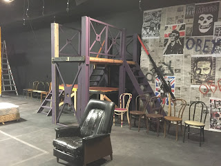
For American Idiot's original designers as for me, that media is the backdrop for our show. Actually, and metaphorically, the media is what saturates our heroes. The original set had TVs all over it as well as video projection that washed the entire stage. The walls of the original stage were plastered with posters from punk bands of the day. We do not have the budget for that kind of video media nor the people to produce it, install it and run in.  What we decided to do instead, was to plaster our wall with newspaper, to represent that media saturation.  Interspersed are a few band posters, chosen to reflect the cynicism in that music art form.

Executing this posed a problem in our little black box. Building walls 12' high and 50' long was cost prohibitive, but in the solution, I think that I added yet another layer to the metaphor. To solve it, I chose to use a 9'x12' canvas drop cloth and a 15'x12' canvas drop cloth as my base and wallpaper them with newspaper and band posters.  These hang on the back wall, bubbling, peeling and lifting. They are NOT concrete, just like the world that they represent.  They are imperfect, fluid, and fragile...just like our heroes.


In the original staging, the centerpiece of the set was a multi-story steel fire escape, which served as multiple levels for the roof of the Seven-11, the fire escape on which Johnny first sees Whats-Her_Name, and a variety of other staging.  After discussion, Scott and I felt that we too needed some vertical element on the set to pull off some of these above and below staging requirements.  What I did, while a similar function, is distinctly different in its appearance.  It is more industrial, more gritty.  It can be a building, fire escape, or ruins in war.  It is not as one-dimensional in looking like a fire escape as the original design was.


Yesterday was the big load in day.  We managed to get the seating risers all rearranged and the chairs on them in stacks...out of the way.  We then built our structure and hung the smaller of the two media drops.


On Sunday afternoon, I finished wall papering the large drop, so sometime this week, we can get it installed in the theater.

I'll likely squeeze out one more post after addressing the paint treatment for the floor.
R

Friday, February 5, 2016

OK, so I'm a little behind...

The title says it all, at least about my blogging.  I know that I have been remiss in documenting my process this time.  The truth is, I have really struggled with what to say about my process for American Idiot.

Scott and I laid out the basic staging months ago, while Heathers was still on stage.  The original staging for American Idiot makes a ton of sense.  After the opening few minutes of the show, our three "heroes" each take separate, parallel journeys.  The show is written that these stories happen simultaneously, yet interwoven within the lyrics of each number.  For the most part, there are not defined, individual scenes with blackouts in between for scene changes.  The focus of the action shifts, often mid-song from one to the other. Or, with a small bridge.

This implied that we need to have three distinct playing areas that we can separate the action and clearly shift between them.  In a black box, we have a lot of flexibility to pull this off.  Scott and I decided to lay out the stage along the long wall of the theater, making it 50 feet long.  I laid out a seating plan with the seats on risers tiered along the lobby wall so that the audience walks in, down a short vom and is facing the stage, in traditional proscenium fashion. (See the plan above)


To define the three playing areas, we decided to use very similar vocabulary to the original production.  A single piece of furniture in the middle of a pool of light would tell us where we are and with which hero our story is unfolding.

For Johnny, we'll use a bed...a mattress only really...stained and shabby.  This is his journey icon for when he leaves suburbia for the big city and ends up in a shabby apartment somewhere, caught in the drug culture.


For Will, a small shabby couch...the couch in suburbia that he never leaves, that he is tied to by his mistakes and his choices.


For Tunny, his changes.  He starts with a recliner, but his recliner, a suburban device, is really a metaphor for what is to come.  Pretty quickly, he sees glory in the life of a soldier and signs up, being shipped off to war.  His recliner is replaced by a gurney... his "new recliner" after being permanently disfigured in combat.


All three furniture devices (four really with the gurney) are on wheels so that they can move around as needed to free space for the action that is required in one of the other guys worlds.  This allows me to expand and contract each of their worlds as the story shifts from one to the other without ever allowing them to overlap.

There are a few fixed components to the set that I have to address, but more about those in the next post.
R